Normally around this time of year the market is buoyant, in fact looking back over past reports, I was often saying post the credit crunch the market was a ‘game of two halves’ with the first half of the year rising, and the second half of the year falling back. So far this year, prices have pretty much ‘limped along’ from one month to the next showing little growth. There has been some criticism of the Halifax data and I agree there is an issue. We noticed when the recession hit their data had become erratic and didn’t match other reports, especially when it came to month on month/year on year changes. However, that doesn’t mean all their data should be ignored, the longer term analysis they do on seaside towns, first time buyers, best places to live etc are often useful and good PR the industry can use with consumers.
Country wise, Wales and Northern Ireland continue to do well year on year, although prices haven’t really changed much for 12 years now in Wales, while in Northern Ireland, the average price being just over £136,000 versus the low of £97,428 is an amazing recovery – although sadly not a rise people can benefit from if they bought at the average £225,000 seen before the crash. Scotland is perhaps the surprise this month with the figures suggesting a backward step and no growth since 2007/8. It appears this is mostly down to prices falling for flats rather than houses and Aberdeen is one of the toughest markets while areas like Midlothian seem to be thriving. According to the Land Registry “prices increased over the last year in 22 out of 32 local authority areas”. Scotland is such a diverse mix of geographies it’s important to focus on local market expertise rather than averages and it’s worth noting the RICS gives a much more positive view of the Scottish market.
Read Kate Faulkner's full report here
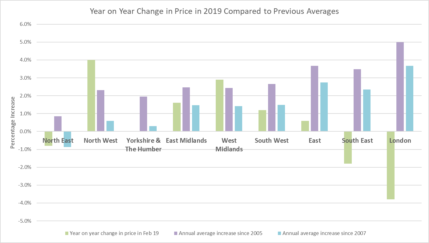
The chart below clearly shows the regions with high growth since the credit crunch are now falling backwards, with most of the other indices such as the RICS and LSL suggesting the South West is now following falls of those seen in London and the South East. Meanwhile, Home.co.uk are showing this is reflected in the time to sell in these areas. The anomaly is the North East. Despite better volumes and quicker selling times, prices don’t seem to be showing much movement. In the past, improved transaction levels typically meant price rises on the way and vice versa, but in our ‘new era’ of property market performance, many of these ‘old trends’ aren’t applicable, again showing the need for the property industry to promote what’s really happening in the property market at a local level.

Source: UK HPI
City and town wise, the diversity of the market increases. The Hometrack data clearly shows the ‘north south divide’ has ‘flipped’ with northern towns such as Liverpool and Manchester performing well, while those in the south suffer. But the split isn’t straightforward with Oxford and Aberdeen both struggling year on year. On our five year analysis for the top and lowest growth cities, they show a bizarre picture with the top year on year performers currently appearing in the worst growth areas over the last 11 years!
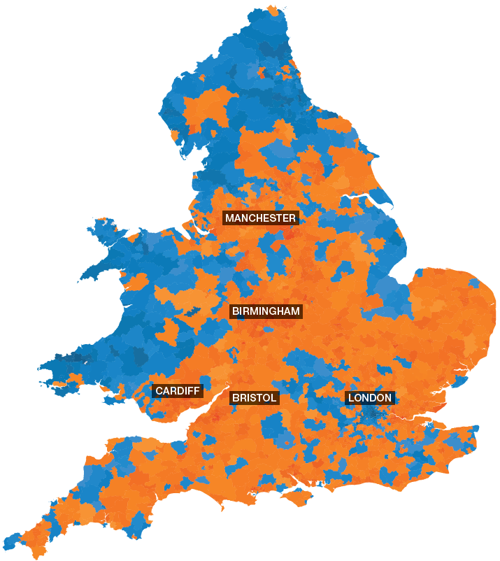
To some extent, the government is likely to be ‘patting itself on the back’ for succeeding in growing home ownership with more first time buyers coming into the market. According to Nationwide, numbers are not far off what they were before the credit crunch, this is despite a relatively uncertain market at the moment. Hometrack have produced a useful chart this month showing how regional market volume changes have been too. They explain “Falling sales volumes after a prolonged period of high house price growth is part and parcel of the unfolding housing cycle. The reality is that the more house prices increase over time, the more buyers are priced out of the market through a mix of affordability factors and higher moving costs. Figure 3 (chart over page) shows the relationship between price growth since 2008 and the change in sales since 2015. It shows cities with the greatest increase in house prices have registered a steeper decline in sales since 2015 - the year with the highest overall sales since 2007.” Meanwhile, The Advisory shows how market demand and supply is performing right down to postcode level, showing hot and cold buyer markets. This data is useful to use with people, for example who live in Liverpool and are being told it’s performing well when clearly if it’s in L2 this isn’t necessarily the case!
Read the complete demand, supply and transactions report here


Source: The Advisory
| Plumbing checks to make on your home - WaterSafe |
Working with an architect - Urbanist Architecture |
How to evict a tenant - Landlord Action |
 |
 |
 |