
If you are interested in property prices, you should be celebrating the new index from the Land Registry, Office of National Statistics, Registers of Scotland and Land & Property Services Northern Ireland (LSPNI).
If you just want to get stuck in, visit the new index now.
However, here’s a walkthrough on how the new index can help you, whether you are buying, selling, investing or, indeed, thinking of building your own home.
Kate’s guide to the new gov.uk UK House Price Index
The first thing to know about the new index is for the first time we can break out and compare England, Wales and Scotland on a monthly basis and N.Ireland on a quarterly basis.
Why does this matter? Because we can assess different housing policies
Well each country within the UK now has the right to run its own housing policies. As a result, we’ll be able to see individually how different policies affect property prices.
For example, Scotland is looking at more affordable homes and is clamping down very heavily on landlords, so it will be interesting to see over time how this compares to the English housing policy of driving home ownership at the expense of the rental market and a horrendous lack of investment in truly affordable homes, ie those for people on benefits/low pay.
Read - First Time Buyer Quick Guide
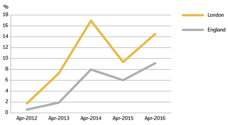
England’s property price performance is separated from Wales and London inflation highlighted separately
This is even better. In the past the Land Registry gave us England and Wales data, then Wales-only data, but not England. Plus, the English data always included London, which skewed the results. What they now show is how much higher London property price inflation is than the rest of England, putting up average house prices across the country and presenting an artificial picture of the property market.
Here’s the chart on English house price inflation with London separated out:
What does the report say about average prices?
The latest April report shows that the average property price in England was £224,731 and annual price inflation was 9.1%, whereas in London price inflation over the last year was over 14%, so clearly had a big influence on the English average.
Why are prices higher on this index than on the Land Registry one?
We’ve compared the ‘old’ Land Registry property prices to the new ones and, in the main, we are seeing these average prices per region being 15-25% higher than the previous one.
Interestingly though, London averages have dropped by 10%!
Read - How to Sell your Home Quickly
So why is this happening?
I’ll get back to you on that with an official response…. The ONS data was always higher than Land Registry though, so I expect it will be down to the data input and the way it’s being calculated.
Local data can be secured both in ‘sold property price data’ as averages, but also localised ‘price paid data’
Do have a look to see what’s happening in your area, by visiting this brand new Land Registry tool and check out sold property price data charts down to local authority level.
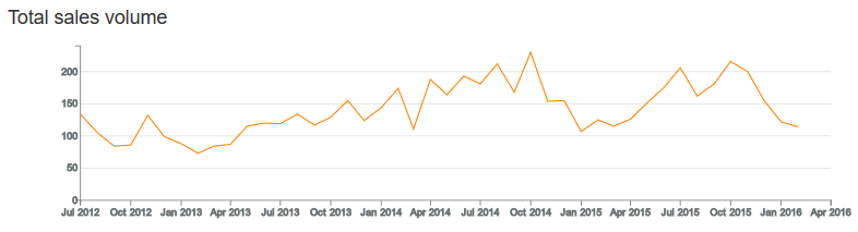
How awesome is this? Say you are in West Bridgford, which is in Rushcliffe, Nottinghamshire, you can check out what has happened since you bought your own property.
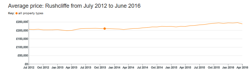
Now have a look at all the data I can get on the recent market they tell you below, but bear in mind Land Registry data is normally about three months or more out of date from when the offer was made, so you still need your local agents to give you the most up-to-date information.
From the figures in the chart above, you can work out that prices in Rushcliffe have increased by 16% in the period selected so, to get an idea of what your property is currently worth, you can select your location and purchase date and apply the increase to the price you paid.
Read - Trading Up
If an agent is coming to visit or you want to discuss the market, you can take this data with you when you meet with local agents, and use it to discover whether they are on top of market changes or just trying to get your business by over-valuing your property, making you think your property is worth more than it actually is.
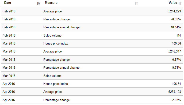
And the volume data shows you how buoyant or not the market is as well as looking at prices. How? Well property prices typically go up when sales increase and fall or stagnate when sales decrease; and the chart below really shows you what’s happening.
For more detailed information, check out the price paid data which gives you information at postcode level.
It looks like this, so if you put in your road and your property type – plus whether it’s new or not and freehold versus leasehold – it will give you the data of what’s sold in your exact area:
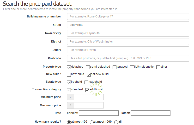
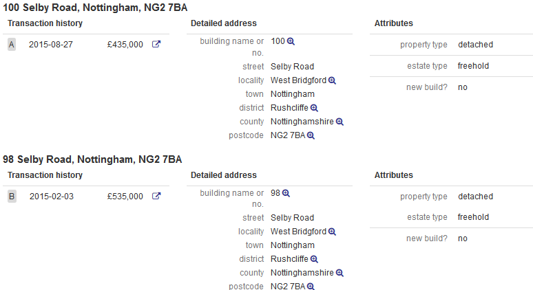
Then you get the last sales for the date range you want. Find the properties on your street, or nearby which are most similar to yours, and see what sold in the past.
There are other sold property price data portals you can look at for the same thing, too. For example we work closely with Nethouseprices.com and the advantage of their data is you can see which agents actually sold the property. This is fab information as you can then approach that agent to find out what they think your property is now worth, having already liaised with buyers for a similar property recently.
But there is more!
The best bits are yet to come as the data now gives us much more than it ever did before.
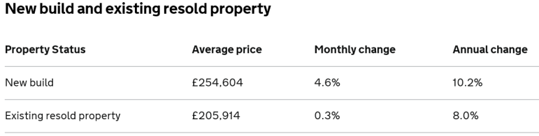
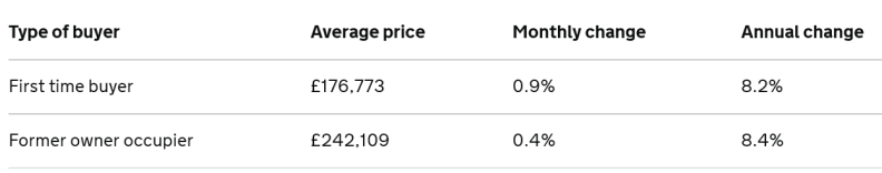
For example, you can get separate price breakdowns for new build versus existing homes; the below is all based on UK data, but you can get this broken down for England, Scotland and Wales, too.
And you can see from the data, first-time buyers pay on average 27% less for a property than existing homeowners, although in our experience it can be even less than this… in some regions it can be more than 40% lower than existing homeowners.
Last, but by no means least… we can see what price people are paying for properties with cash and with a mortgage. Why does this help? Well if mortgage rules continue to be tightened, we can track whether cash purchase inflation rates are higher than mortgaged purchases.
All in all, this data is brilliant and widens the commentary on property away from dangerous and misleading average prices. It also allows us all to take control of monitoring what’s happening in our local area so we can all be much more realistic about what to pay for a property, what our own property is worth and ultimately make better property decisions.
Any comments? Any questions, do let me know (contact us)
